Accessibility Isn’t Compromising, It’s Smart Design
Alright, I’ll say it. Accessibility gets ignored way too often. Teams obsess over SEO tweaks that barely move the needle, but when it comes to making a site usable for the people who need it most, everyone freezes. Here’s the thing, accessibility isn’t a compromise. It’s smart design, and it makes your site better for everyone.
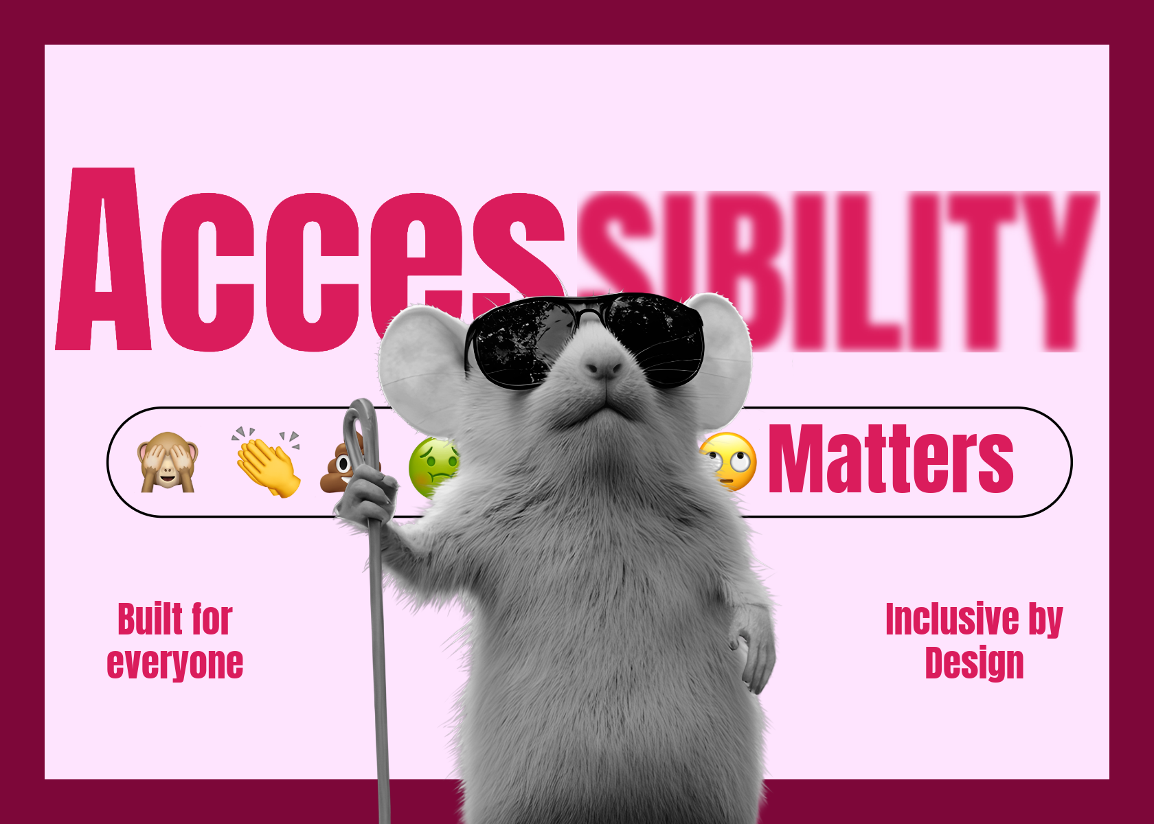
Why Accessibility Matters
Being accessible doesn’t mean sacrificing design. Alt text, semantic headings, meaningful link labels, and thoughtfully used emojis can all fit seamlessly into a beautiful website. These details don’t make your site boring, they make it usable for everyone, and usable sites are more enjoyable for all visitors, not just those using screen readers.
Think about it like this: you’ve worked hard to get people to your site. Why spend all your energy trying to squeeze a few extra clicks from Google when you could spend that time making sure everyone can enjoy it once they arrive? Accessibility is smart design, plain and simple.
Accessibility Goes Beyond Websites
Take LinkedIn, for example. Many people add lots of emojis to their posts to make them stand out or feel more personal. The challenge is that for people using screen readers, every emoji is read out in detail. If you use several emojis as bullet points, or place them in the middle of a sentence, the meaning of your post becomes interrupted. What looks fun visually can quickly become frustrating to listen to.
A better approach is to use emojis sparingly and with intention. Placing them at the start or end of a post works well, as this keeps the content engaging without creating unnecessary barriers for people who rely on assistive technology.
Easy Steps to Make Your Content More Accessible
1. Avoid Using All Caps for Long Text
All caps may feel like shouting, and they’re much harder to read than regular text. Save caps for headings or very short phrases, and use standard sentence casing for body text. This makes your content easier to scan and more comfortable for everyone to read.
2. Use Clear, Legible Fonts
Choose fonts that are easy to read across devices and sizes. Avoid overly decorative fonts for body text, and ensure your line spacing and letter spacing are comfortable. Simple, clean fonts improve readability and reduce eye strain.
3. Aim for AAA-Level Contrast
High contrast between text and background is crucial. The WCAG AAA standard ensures even users with low vision or colour blindness can read your content without difficulty. Tools like contrast checkers can help you verify your colour choices.
Check your colour scheme here
4. Write Meaningful Link Labels
Instead of “click here” or “read more,” use descriptive link text that tells users exactly where the link will take them. This helps screen reader users and improves overall usability.
5. Add Alt Text for Images and Graphics
Provide descriptive alternative text for images, charts, and graphics. Alt text allows screen readers to convey the content to visually impaired users, and it can also improve SEO. Keep descriptions concise but informative.
6. Make Backgrounds and Overlays Work for Readability
Backgrounds, especially images and videos, can make text hard to read. Use overlays, gradients, or solid backgrounds behind text to ensure it stands out. This not only improves readability for everyone but also makes your content visually appealing and less busy. This is particularly important for social media graphics, where images are common and text often competes with busy visuals. Clear, clean backgrounds help your message stand out and ensure it reaches everyone, no matter their vision or device.
Listen to Your Data: Accessibility Gets Musical
Here’s one that will blow your mind: some websites let you listen to data as well as staring at it. It’s called data sonification, and it turns charts, graphs, and stats into sound so you can literally hear trends, spikes, and patterns. Imagine learning about the stock market as a melody or climate change data as a symphony. Tools like Sonification Design are making this possible. It’s proof that accessibility doesn’t have to be boring.
What This Means for Marketing Teams
For design and marketing teams, accessibility should be seen as strategy, not a burden. Clients want more than just a pretty layout; they want websites and digital experiences that actually work and convert. Teams that integrate WCAG standards, write meaningful alt text, and use accessibility features creatively stand out and build a better relationship with all their customers, not just the majority.